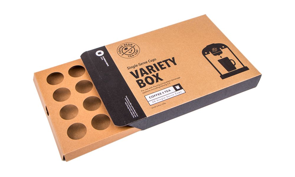
Some businesses believe they must go above and beyond for their product packaging designs to grab the attention of customers. However, not every product in the market will benefit from big, bold, and bright designs. Minimalist packaging benefits many products, such as cosmetics and luxury items, because it supports a sophisticated aesthetic. If this design style is something you plan to implement, use our minimalist packaging design guidelines to ensure you’re doing this correctly.
Less Is More
Essentially, minimalism means omitting unnecessary things. Therefore, the saying “less is more” could never be truer than with this packaging style. The less you put into your design, the more minimal it will appear, which is the goal! Overcrowding the graphic with too many ideas will create a mess. After finishing your design, take a step back and determine what elements you could omit and what features need to stay.
Go Green
Environmentally responsible materials and minimalism go hand in hand. Minimalists only use what they need and what serves a purpose to them. Taking only what you need from sustainable materials will prevent excess waste and create a well-rounded minimalist package that’s environmentally friendly.
Add Dimension With Senses
Our five senses tell us a lot of information about something. Adding a texture or finish to your minimalist package can bring in dimension without overpowering the design. In other words, texture can elevate an otherwise flat design without making it too bold. Consider adding a texture to your custom folding boxes to create an immersive experience for your customers while keeping unnecessary elements to a minimum.
Put Emphasis on Your Logo
An advantage you get from a minimalist packaging design is that it draws attention to your branding. Focusing only on what is necessary will ensure customers know exactly who they’re buying from. Your brand style or logo can stand out since there are no distractions. Because there are only a few other visuals, customers are more likely to remember your brand. Emphasize your logo for brand awareness while keeping everything else minimal.
Adding too many guidelines for minimalist packaging design would get in the way of the point we’re trying to make. Don’t think too hard about the design, or it’ll become bold and bright instead of minimalistic. Remember the guidelines above to create a perfect yet minimal design that catches your customers’ attention.


