


When you’re creating art in graphic design, there are two different color palettes you could work with to add saturation and color to a project. These color palettes include RGB and CMYK—but is one better than the other? Keep reading to understand more about these color palettes and when one may suit your project better than the other.
What Is RGB?
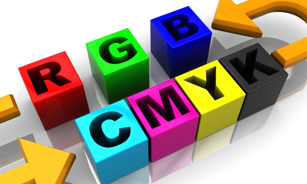
RGB stands for red-green-blue and is the primary color palette for digital images and displays. Within our digital devices are red, green, and blue bulbs that light up at different intensities to show color on a screen. For example, your favorite smartphone app uses the RGB model to create colorful graphics on your phone!
RGB is an additive mixing process. All colors in the digital workspace start as black, with red, blue, or green added to create the perfect hue and color intensity. Modifying any of the three colors can create millions of different color combinations.
What Is CMYK?
CMYK stands for cyan-magenta-yellow-key/black and is the primary color palette for printed images and materials. Since the “B” in RGB stands for blue, developers use “K,” the last letter in the word black, to represent the color and avoid confusion. Printers use this color set to print an image onto a page.
CMYK is a subtractive mixing process that combines colors in ink to create the perfect shade. All colors begin as white, while each ink layer reduces the brightness of the shade. Mixing the CMYK color palette creates thousands of different color combinations.
When To Use Each Color Palette
Regarding the difference between RGB and CMYK, the project you’re working on will determine whether one is better than the other. For instance, when designing a new logo for a website or digital icons, you would use RGB to construct the colors in the project. Meanwhile, when you’re physically printing on a medium, you will use CMYK to build the colors.
Which Palette Is Best for Product Packaging?
If you’re using custom-printed packaging for your products, you’ll most likely use CMYK because you’re using physical ink to create designs on a packaging medium, such as folding cartons. Your colors’ tones, hues, and intensity will change drastically upon printing if you use RGB to make packaging designs. CMYK will ensure the colors print in high quality, creating richer and more vibrant-looking graphics.
The bottom line is that if you’re making designs that need printing on packaging mediums, you will use CMYK to color these graphics. And if you’re making website designs, you will use RGB to color graphics. Knowing the difference between these color palettes will help you determine which one is better than the other, depending on the medium of your project.
At Golden West Packaging, we meet our customers’ expectations by using CMYK color palettes to create all product packaging designs. Consider working with us to create a product package that looks and feels luxurious!