

Choosing the right packaging colors is a critical decision in the world of e-commerce and marketing. The colors you select can significantly impact your brand’s perception, influence consumer behavior, and ultimately, affect your bottom line. Whether you’re launching a brand-new product or rebranding an existing one, your choice of color is crucial to the success of the product.
Choosing any odd color from the rainbow won’t do. Many factors go into deciding which hue is right for your packaging. Consider our advice in this guide below as you design effective packaging with the right colors.
Who Is Your Target Audience?
Understanding your target audience is the first step toward selecting the perfect packaging colors. Different demographics respond to colors in various ways. For instance, children often appreciate bright, vibrant colors, while adults might prefer more subdued, sophisticated tones.
Consider your target market’s age, gender, culture, and preferences. Looking into market demographics and creating buyer personas can help you gain insights into what colors will most appeal to your audience. Remember, the goal is to choose colors that resonate with your customers and enhance their overall experience with your brand.
Align With Your Brand Identity
Your folding carton packaging colors should align seamlessly with your brand identity. Consistency in color usage across all your branding materials, including packaging, helps in building brand recognition and trust. If your brand is known for its eco-friendly products, shades of green and earthy tones can reinforce this message.
Conversely, if your brand exudes luxury and sophistication, colors such as black, gold, or deep purple might be more appropriate. Evaluate your brand’s values, mission, and personality, and choose colors that accurately reflect these attributes.
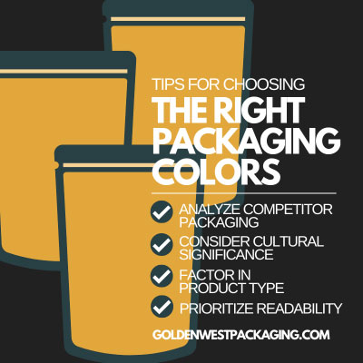
Analyze Competitor Packaging
Analyzing your competitors’ packaging can provide valuable insights into what works and what doesn’t in your industry. While you don’t want to copy their designs, understanding the prevalent color trends and choices can help you differentiate your product.
Look at the top-performing brands in your niche and assess the colors they use. This analysis can also help you identify gaps in the market where you can introduce unique color schemes that set your packaging apart.
Consider Cultural Significance
Colors carry different meanings and connotations in various cultures. When choosing packaging colors, it’s essential to consider the cultural significance, especially if you’re targeting an international market.
For example, in Western cultures, white often symbolizes purity and cleanliness. However, in some Asian cultures, people associate white with mourning. Being mindful of these cultural differences can prevent potential misunderstandings and ensure your packaging appeals to a broader audience.
Factor in Product Type
The type of product you’re packaging should also influence your color choices. Different colors can evoke different emotions and perceptions about the product inside. For instance, food products often benefit from warm, appetizing colors such as red, yellow, and orange, which can stimulate appetite. In contrast, tech gadgets might look more appealing in sleek, modern colors like silver, black, or blue. Consider how the color of your packaging can enhance or complement the product it contains.
Consider Visual Impact in Various Contexts
Consumers will be able to view your packaging in multiple contexts. Consider how it will look on store shelves, e-commerce websites, and social media platforms. It’s crucial to choose colors that maintain their visual impact across different mediums and lighting conditions.
Conduct tests to see how your packaging looks under natural and artificial light, and ensure the colors remain vibrant and true to your brand. High contrast and bold colors can often stand out better in crowded or visually competitive environments.
Prioritize Readability
While the aesthetic appeal of your packaging is essential, you should never compromise readability. Ensure that the text on your packaging is legible against the background color. High contrast between text and background can significantly improve readability.
For example, dark text on a light background or vice versa tends to be easier to read. Additionally, consider the font size and style to ensure your customers can easily access the information on your packaging.
Use Psychology of Colors
When you want to influence consumer behavior, leveraging the psychology of colors has a massive impact. Different colors can evoke specific emotions and reactions.
- Red: Excitement, passion, and urgency—often used in sales promotions
- Blue: Trust, dependability, and calmness—popular in corporate and tech industries
- Green: Health, tranquility, and eco-friendliness—common in natural and organic products
- Yellow: Optimism, warmth, and happiness—effective in capturing attention
- Black: Luxury, elegance, and sophistication—frequently used in high-end products
Understanding the psychological impact of colors can help you choose hues that align with the emotional response you want from your customers.
Here is an example to help you better understand color psychology. Let’s say you want to position yourself as a leader in sustainable, eco-friendly skincare products. Making your primary packaging color a soft, muted green showcases nature, health, and renewal to the customer. This color choice can subtly communicate the product’s natural ingredients and the brand’s dedication to sustainability.
Adding accents of brown or beige emphasizes the organic, earth-friendly ethos, reinforcing the message that the products are safe, natural, and good for the planet. This strategic use of color psychology in packaging design makes the product stand out and aligns with the brand’s identity and values, making it more attractive to the target audience.
Test Multiple Variations
Before finalizing your packaging colors, it’s wise to test multiple variations. Create prototypes with different color schemes and gather feedback from focus groups or through A/B testing. This process allows you to see which colors resonate most with your audience and make informed decisions based on actual consumer preferences. Testing can also help you identify any potential issues with color combinations or readability that you might have overlooked.
Stay Trend-Aware but Timeless
While it’s important to stay aware of current color trends, it’s equally crucial to choose colors that have a timeless appeal. Trends come and go, but your packaging should endure and remain relevant over time. Striking a balance between trendy and timeless can help ensure your packaging remains attractive and effective for longer periods. Consider incorporating classic color schemes with subtle nods to current trends to achieve this balance.
Choosing the right packaging colors is a nuanced process that requires careful consideration of various factors. Each factor plays a vital role in ensuring your packaging is both attractive and effective. Choosing a random color won’t do, but now you know exactly how to find the perfect hue for your product packaging. Implement our advice today to watch your packaging transform into a powerful marketing tool.